Designing for recognition, not explanation
Kraymer Journal
If the product name vanished, would the reference still have a life inside the object?
Product captions can make almost any design sound meaningful.
Give a shape a character name, describe three visual links, and the reader starts connecting dots. That can be useful when telling the story of a piece. It can also hide a design that is not carrying enough of the story itself.
I want recognition to begin before the explanation.
The no-name check
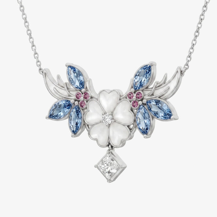
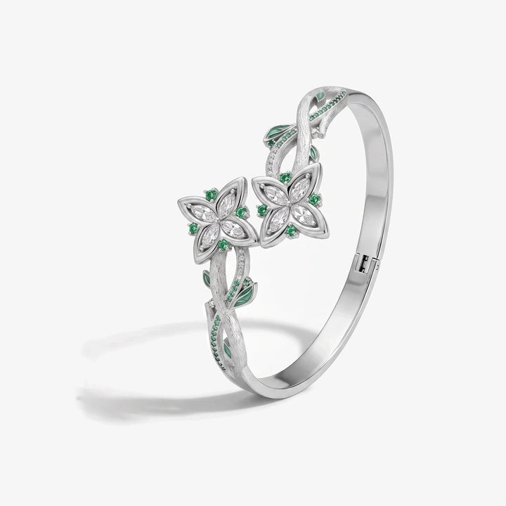
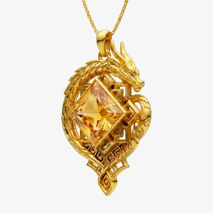
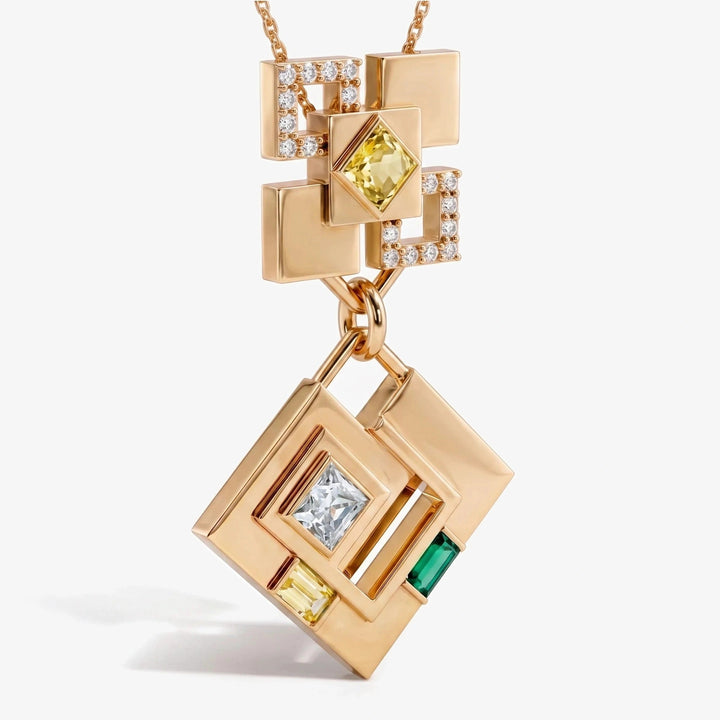
Before a piece gets the help of a product title, give it a deliberately boring one: Untitled Necklace 1.
Then ask three questions. What does the eye notice first? Which clue belongs to this character rather than the series in general? If you remove the caption, do the remaining clues agree with each other?
This catches a particular problem early. A design can contain several accurate facts and still have no point of view. The no-name check forces the object to organize those facts before the copywriter turns them into a story.
A symbol is not the same as a logo
A logo identifies a series because people have already learned what it means. It brings that meaning with it wherever it is placed.
A symbol inside a design has to do more. Its size, position, and relationship to the rest of the piece change how it feels. The same shape can look like an afterthought, a focal point, or part of the structure.
That distinction matters. I do not want the jewelry to feel like a blank object with fandom applied at the end.
Recognition needs enough evidence
A subtle design still needs to give the fan something real to notice.
One accurate color may be too little. Ten references may be too many. The useful amount depends on how specific each clue is and whether they agree with one another.
I look for a combination that feels inevitable after recognition. Before the fan sees it, the design should make sense. After they see it, the choices should feel connected.

Leave some work for the fan
Fandom knowledge is part of the pleasure.
When a piece explains every reference immediately, the viewer receives the answer without getting the small satisfaction of finding it. When the reference is completely hidden, there is no answer to find.
The design needs enough space between those outcomes. A fan can notice, connect, and feel clever for a second. The object rewards what they already know.
Explanations should add, not rescue
I still like telling the story behind a piece. A journal post, product page, or sketch can reveal why a shape changed and which detail mattered most.
That story should deepen the object. It should not be the only place the meaning exists.
The test is simple: cover the title and look again. If the design loses the character entirely, the next step is not a better caption. It is another drawing.
See the finished work in the jewelry collection and jewelry sets, or read The if-you-know test.
Wear the story