Why subtle anime design is harder
Kraymer Journal
A logo gives you recognition for free. Take it away and the design has to earn that recognition.
A character face does a lot of work for a designer. So does a logo. Put either one on an object and nobody has to wonder what it references.
Take them away and the design has to earn its recognition.
That is why subtle anime design is harder than it looks. The goal is not to hide the fandom until nobody can find it. The goal is to keep the part a fan cares about without turning the piece into a miniature poster.
Obvious can still be lazy
An object can be covered in references and still say very little about the character.
Color alone is not a concept. Neither is placing a familiar symbol in the middle of a generic shape. Those choices may be recognizable, but recognition and understanding are not the same thing.
A stronger design asks why a detail matters. Does it show power, tenderness, control, loss, or a relationship? Does the shape behave like the character, or is it only wearing the right colors?
The answer does not need to be dramatic. It needs to be specific enough to guide a decision.
The cut is part of the design
When I begin, there are usually too many possible references. The tempting move is to keep adding until every fan can see every idea.
That creates noise.
Instead, I look for the detail that can carry the most weight. Once that is clear, I can judge the rest honestly. A second motif might strengthen it. A fifth usually competes with it.
Subtlety comes from hierarchy, not from making everything tiny.

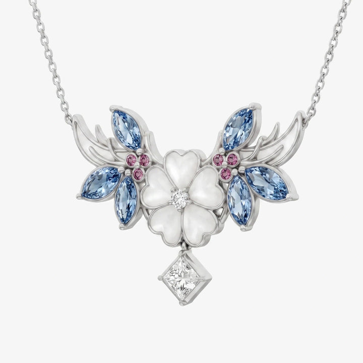
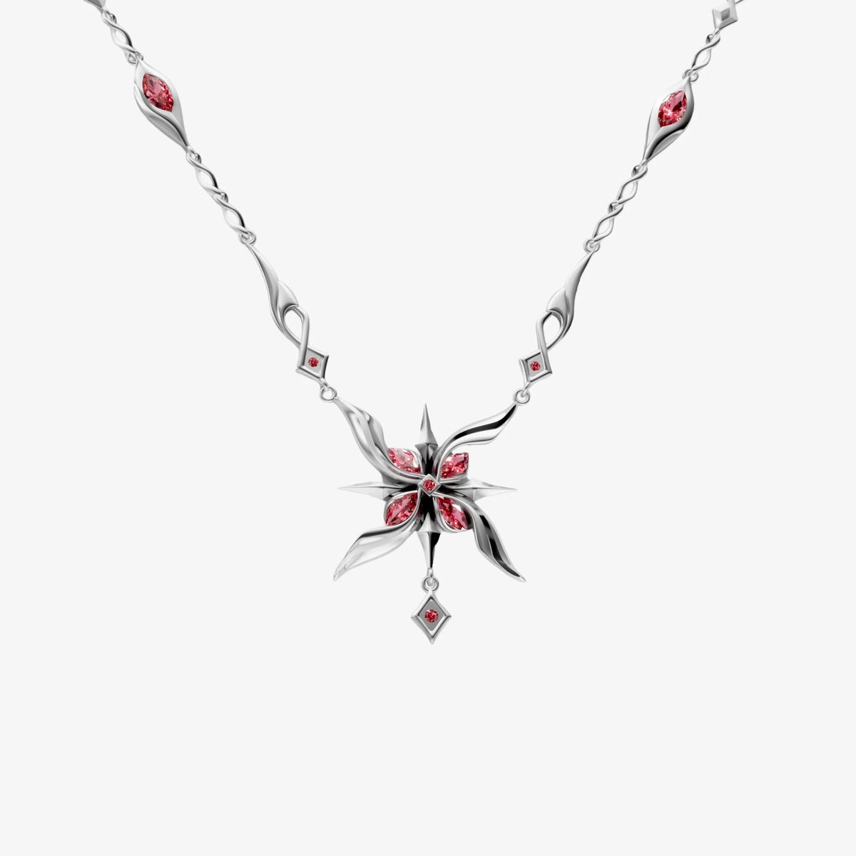
The Arlecchino Necklace makes the standard concrete. I can look at the product image without the title and ask whether the composition feels deliberate before I ask whether the reference is clear. If the name has to supply the whole character, the object is not finished. If the object works but the fan has nothing specific to recognize, it has drifted too far in the other direction.
A design should work before the caption
Product names can rescue weak ideas. If a listing says exactly which character inspired a piece, the reader fills in gaps the object did not solve.
I try to ignore that help during the design stage. If the name vanished, would the shape still feel intentional? Would a fan have a fair chance of recognizing the reference? Would a non-fan still want to look closer?
That does not produce one correct answer. Some pieces should whisper. Others can be more direct. The test simply stops the caption from doing all the work.
Restraint gives the wearer control
The wearer should decide when to explain the reference.
They can tell the full story when someone asks, share a small smile with another fan, or say nothing and let the piece stay beautiful on its own. A quieter design leaves room for all three.
That control matters to Kraymer customers. In a style survey of 364 respondents, 71.4% preferred minimalist or subtle anime designs. The interest is not smaller. The expression is more flexible.
You can see how that principle changes across the full jewelry collection and the Genshin Impact collection.
Wear the story