From an iPad sketch to something someone can wear
Kraymer Journal
A drawing can do anything. Jewelry has to survive scale, light, movement, and the clothes someone actually owns.
Every piece starts in the place where I am most comfortable: a drawing.
That part can be misleading. A drawing on an iPad has no weight, no clasp, no skin beneath it, and no fixed size. You can zoom until a tiny line fills the screen and convince yourself the detail is doing important work.
Then you shrink it down and almost all of that work disappears.
Designing jewelry forced me to look at my drawings differently. The question stopped being, "does this look good on the canvas?" It became, "what is left when this is small enough to wear?"
Find the part that has to survive
A character can give you dozens of possible references: colors, symbols, clothing, weapons, expressions, and relationships. Jewelry cannot carry all of them with equal weight. If I try, the piece becomes a list.
So the first useful decision is usually a cut.
What is the one detail that makes the idea recognizable? Which part carries the feeling, even after the rest is removed? That becomes the centre. Other details stay only if they make that centre clearer.
This is closer to editing than decorating. The design gets stronger because it has less to explain.
A screen lets you cheat
Digital art is forgiving in ways physical objects are not. A thin line can stay perfectly sharp. A highlight can land exactly where you paint it. The viewer sees the work from the angle you chose.
Jewelry moves. Light changes. A pendant turns slightly on a chain. A ring is seen from the side while someone is talking with their hands. The design has to keep working through all of that.
That changes the drawing. Lines need enough presence to be read. Empty space starts doing real work. Stones are not just colors placed on top. Their size and setting change the balance of the whole piece.

The limits are annoying at first. They are also useful. They make it impossible to hide a weak idea under more detail.
The non-fan test
Before a design feels finished, I want it to work for two people.
The fan should recognize the source. The non-fan does not need to understand the reference, but they should still understand why the object is beautiful. If the piece only becomes interesting after a paragraph of explanation, the design is leaning too hard on the character name.
That test changes small decisions. It can mean simplifying a silhouette, moving a stone, or taking out a reference I liked in the drawing. I would rather lose a clever detail than make a piece that only works in a product caption.
The final object belongs to someone else
The sketch is mine. The finished piece has to enter somebody else's life.
They will wear it with clothes I never saw, attach their own memory to it, or give it to someone who understands the reference better than I do. That is why wearability cannot be an afterthought. The object needs enough restraint to leave my canvas and enough meaning to remain itself.
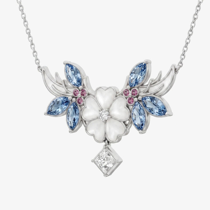
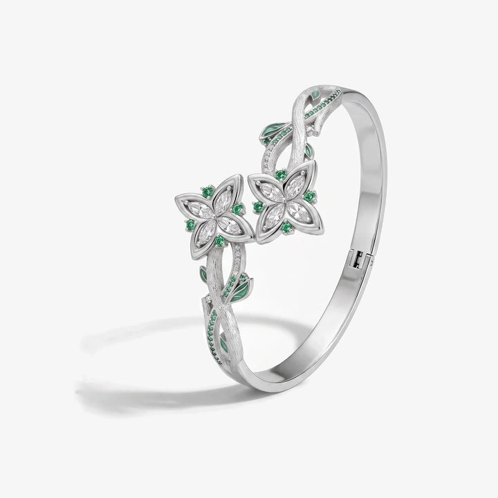
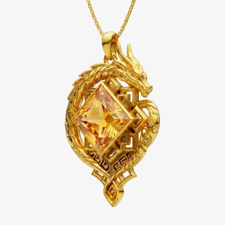
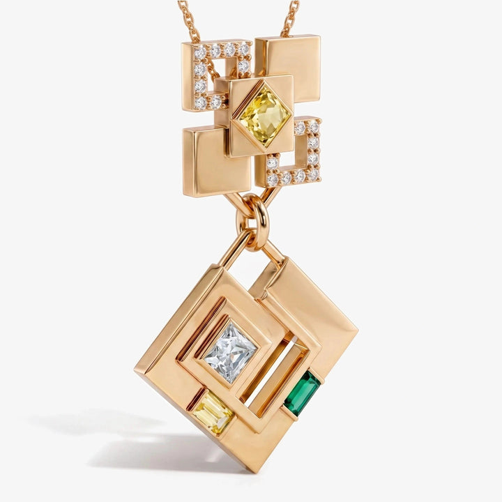
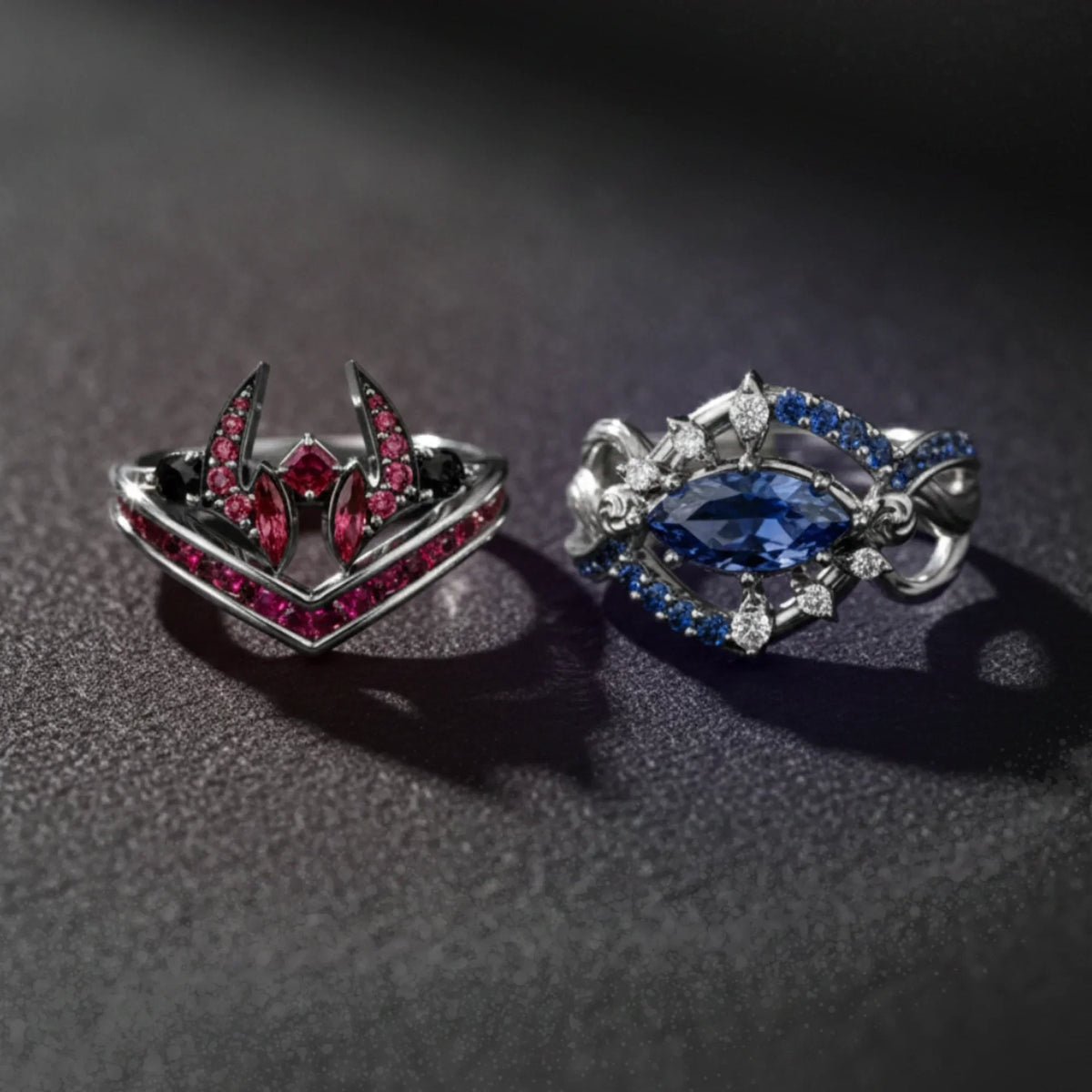
You can see the finished designs in the jewelry collection, including necklaces and full jewelry sets.
Wear the story